
Hi everyone! Samantha here, bringing you today's Tuesday Tips & Tricks. Today, I have rounded up some of my best card making tips and so I am going to share them with you. I call these sneaky tips because they are just those little extra things you can do to your card project to really make the card POP.
Now, I must be honest. I am no a super fancy card maker. I like my cards to be more on the clean and simple side of things because I don't usually want to spend a ton of time on every project. I like to sit down, get crafty, and at the end of 30 minutes to and hour, I like to walk away with a beautiful project that I am proud of.
Sure, I can and do design fancy cards with many layers and embellishments, but it just isn't my normal every day crafting style. One of my favorite things about card making is you can do anything & there is such variety among designs. My tips today are on the clean and simple side of things, but the same design principles can be applied to any card (or scrapbook layout, or 3d item, etc etc. So take these tips and put them into your crafty arsenal if they are new to you and make them your own!
TIP#1: Fancy Background in seconds
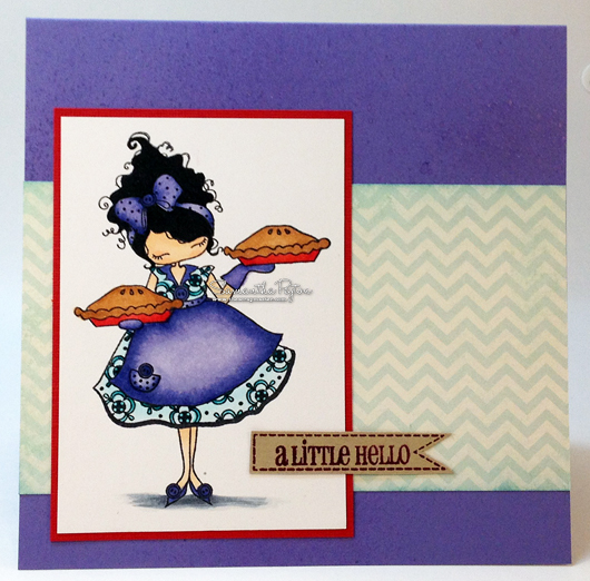
Fireworks Spray creates a great background in literally a few seconds. You could even start with a neutral color cardstock and some colorful sprays. I chose a purple cardstock and LuLu Lavender Fireworks spray for a tone on tone background.


TIP #2: Edges Matter
I didn't want to have to measure my patterned paper strip and then cut a mat layer for it, so I decided to ink up the edges with the Tim Holtz Ink Applicator Tool to provide some depth to the patterned paper. It just gives the patterned paper that extra OOMPH. I use this tool ALL THE TIME on my projects, no matter what ink I want to use. I used an aqua ink to match the aqua paper I was using.


TIP #3: Easy Mat
Want to know my secret for an eye catching mat layer for your image? Here it is! Make your mat layer out of the color that shows up the LEAST in your image. My image is called LuLu's 2 Pies from Stamping Bella. It is heavily colored in aquas and purples, but I made the pie tins a different color from the rest of my image. I chose the red to use for my mat too so that it would be an attention grabber.

TIP #4: Eye Popping Sentiments
Banners are all the rage these days so why not put your sentiment on one?! I put my sentiment onto a banner and placed the sentiment so it was partially covering my image layer. I decided to place my sentiment there to break up all the squares on the card. It was just a way to make your eyes drawn to it.

TIP #5: Grounding
This is a tip that I have brought up again and again -add a floor to ground your image on your project. This grounding makes it look like your image isn't floating around on the page.
And with my five tips in hand, I leave you with some photos of my finished project. This project has just five easy layers (if you even count the sentiment as a layer) but it was made using some of my best quick tips for creating eye catching creations.

Thanks so much for stopping by! The amazing Tracy will be back tomorrow to share something amazing with you. See you soon!


2 comments :
This is so cute!! I love the 5 tips. I will certainly be putting them to use.
Gale
GREAT tips!! TFS! :)
Post a Comment